Those of us who love languages savour their similarities and differences. As well as being a fun challenge, the Great Language Game is also a source of evidence on what languages people find similar. I'd like to introduce the first release of user data from the game, data that will help researchers and hobbyists investigate language confusion themselves.
You can find the dataset itself, and any future updates, at the datasets section of my homepage. In this post I describe the basic structure, and the dimensions of time, difficulty and language found in the set.
Structure
The dataset consists of 16,511,224 JSON records, one per line, where each record is a particular guess by a user. It's 2.8Gib in size uncompressed, so not something to browse lightly. Each record looks like:
{
  "target": "Turkish",
  "sample": "af0e25c7637fb0dcdc56fac6d49aa55e",
  "choices": ["Hindi", "Lao", "Maltese", "Turkish"],
  "guess": "Maltese",
  "date": "2013-08-19",
  "country": "AU"
}
This tells us that a particular sample of Turkish was played to the user. They had four choices to pick from, and they mistakenly picked Maltese. We also know the date of their guess, and the country we detected they were from, based on a geoip lookup.
So, we have a few different dimensions we can examine: time, difficulty and language.
Dimension: time
The date field marks the day a user's answer was given, and in this dataset spans 2013-08-19 to 2014-03-01 inclusive, with a median of 45,530 questions answered per day. If we plot the question volume over time, we can see spikes
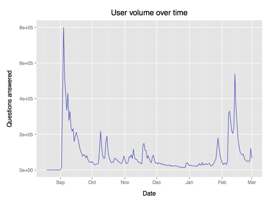
This uneven distribution over time might be important to take into account if you're analysing this data yourself.
Dimension: difficulty
The game has two difficulty mechanics built in:
- As you answer more questions correctly, more choices are introduced to each question
- Languages more easy recognised are weighted to be played earlier in the game, and harder languages are weighted to be played later
In an earlier post we looked briefly at this difficulty ramp, which certainly features in this dataset. However, if we plot accuracy against the number of choices given, something curious emerges:
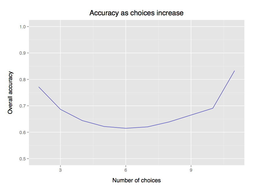
At first accuracy goes down, since the difficulty is increased. However, beyond 6 choices, the effect is overcome by power users, who drill themselves repeatedly on the game and are much more accurate than normal users.
Dimension: language
Now for the exiciting bit! There are 78 languages in this data set, which ones are being confused the most?
| Language | Region | Accuracy | Total guesses |
|---|---|---|---|
| Kannada | India | 0.393 | 119509 |
| Fijian | Oceania | 0.415 | 115852 |
| Shona | Africa | 0.439 | 82478 |
| Dinka | Africa | 0.441 | 122139 |
| Hausa | Africa | 0.445 | 81236 |
The lowest accuacy languges seem to be from India and Africa. It's hard to say whether this is because of low cultural influence, or merely due to the demographic of the game's players.
What are the most easily recognized languages?
| Language | Region | Accuracy | Total guesses |
|---|---|---|---|
| French | Europe | 0.938 | 346851 |
| German | Europe | 0.920 | 342774 |
| Spanish | Europe & South America |
0.896 | 339585 |
| Italian | Europe | 0.892 | 337258 |
| Russian | Eurasia | 0.878 | 331378 |
The most recognized languages are all European. My guess is that had English been in the game, it would likewise be featured on this list.
Overall, does having more native speakers in your language tend to mean it's recongized better? Let's check by comparing population size for each language with user accuracy on that language:
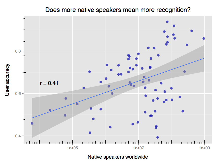
Yes! There's a weak correlation between user accuracy and the number of native speakers. On the margins are large-population low-recognition languages like Kannada (38,000,000 speakers; 0.393 accuracy) and low-population high-recognition languages like Icelandic (330,000 speakers; 0.703 accuracy). Note the log scale on the plot's x axis; it indicates diminishing returns on improved recognition as the speaker count increases.
So what languages are being confused for each other? If we count how many mistakes were made, and divide through by the number of opportunities (excluding correct answers), we can put together a confusion matrix such as below:
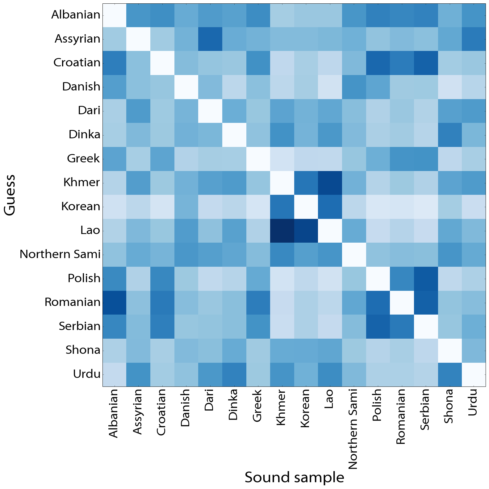
The darker squares indicate higher instances of relative confusion between two languages. For example, Khmer and Lao are often confused for one another. Confusion is not always symmetric: Albanian is confused for Romanian more than vice versa. The full comparison matrix is available here.
Is there more confusion within language families than without? Can we automatically cluster languages into their respective families? I leave these fun questions to be explored.
Dive in!
If you're a language enthusiast with some data analysis skills, download the dataset, have a play, and let me know what you find.